11 Signs You’re Losing Business Because of Your Funeral Home Website
July 25th, 2013
Getting your funeral home online is a HUGE accomplishment.
Since 1 out of 5 funeral homes still don’t have a funeral home website, you deserve a pat on the back if your funeral home has a site.
But – just because you have a website, it doesn’t mean that it’s helping your business. In fact, 9 out of 10 websites in the funeral profession are scaring families away rather than attracting them.
But how do you know if your funeral home website is hurting or helping your business? We’re here to help you find out!
Here are 10 warning signs that your website could be causing you to lose business – and how to nip those mistakes in the bud!
#1 Your website is built for you, not families
When visitors land on your website, what’s the first thing they see? Is it a long paragraph on the history of your funeral home and pictures of your staff, locations and fleet? If so, chances are your website is turning families away.
To understand this better, let’s take a look at this funeral home website:
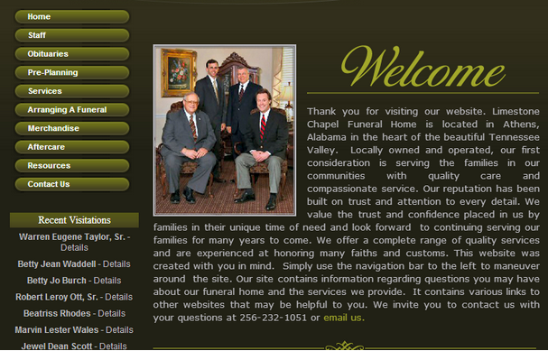
Here’s a few things that are clearly wrong with this website:
1. The design is dark enough to make a grieving person even more depressed.
2. The pictures and content are all about the funeral home, not what they can do for website visitors.
3. The home page looks more like a corporate letter than a website.
4. This website is more focused on selling services rather than proving value.
5. There is no story, voice or personality in the website content.
If you were a family searching for funeral homes in that area, would you think that website addresses your needs? Probably not. Instead, you want a website that addresses your visitor’s problems, questions and pain points and makes them feel comforted during their time of need.
Here is an example of a website that is both uplifting and engaging for families:
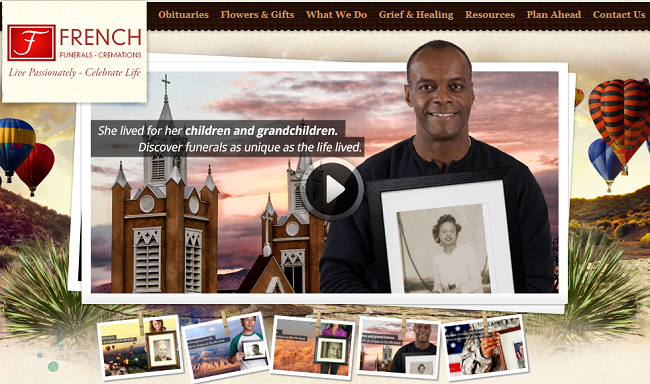
Here’s a few things I love French Funerals website:
1. This site inspires happiness with a bright, uplifting design.
2. The user is automatically engaged with a powerful video that shows families how valuable a funeral service can be.
3. Within this website tells the user what sets their funeral home apart with their copy that says “Discover funerals as unique as the life lived”.
4. The website content, design and images are focused on helping families heal.
5. The personality and tone of the website content is friendly and comforting, representing the level of service this funeral home provides.
As you can see above, by making your website more uplifting, your website visitors will feel more comfortable, they will be engaged and they will explore your website. That means they’ll spend more time on it – to get educated, informed, and connected.
#2 Your website isn’t user-friendly
In this blog post, we learned that the number one thing 76% of users want from your website is to be able to find the information they need. If not, you can lose up to 50% of your online leads!
Here are five ways to make sure your website is user-friendly:
1. Keep the structure of your website basic. A website that buries visitors into pages upon pages can be confusing.
2. Include a simple, easy-to-find navigation or menu bar on the top of your website, as well as a footer on the bottom of your site, so website visitors can click through your site easily.
3. Provide a clear path back to your homepage on every page of your website so visitors don’t get lost.
4. Keep the most important information “above the fold” or the area of at the top of the page that can be seen without scrolling down.
5. Maintain consistency. Make sure the layout of the pages on your website is consistent. Typically, websites have 3-5 main layouts for different types for pages (i.e. home page, form page, service pages).
#3 There are no call-to-actions (or too many)
Calls-to-action (also known as CTA’s) are one of the most important elements of your funeral home website. A call-to-action, just like it sounds, drives a user to take an action of some sort. CTA’s are the key to generating leads on your website, but need to be done right in order to be effective. And unfortunately, many times, funeral home websites get CTAs all wrong.
Many websites either provide no easy way for the user to take an action, or, like the website below, they offer a bajillion actions the user can take (which is confusing and kills your website’s conversion rates).
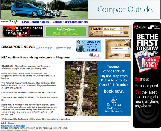
Here is an example of a website with way too many CTAs because it’s flooded with ads that are disruptive to the user experience.
Need help optimizing your website’s CTAs? Then follow these simple tips:
– Make your CTA stand out by making the content bold or incorporating an image.
– Make your CTA clickable by adding a link or button that takes the user to the next step.
– Write short, simple, direct copy that urges visitors to take action.
– Test different elements like the images, placement and copy to see what drives more users to click your CTA.
– Tailor your CTA to the page the user visits. For example, putting a “send flowers now” call-to-action on a social memorial website might be more relevant (and less-salesy) then putting a call-to-action asking a user to pre-plan their funeral.
– Don’t bombard the user with too many CTAs. In most cases, there should only be one CTA per web page.
#4 Your contact information is hard to find
If there’s one thing that’s most important on your website (other than making sure it’s built for families), it’s your funeral home’s contact information. Make that hard to find and I can guarantee you that you’re losing business because of your website. Studies have shown that the best place to display your contact information is “above the fold” of your website (the area users can see on your site without scrolling) and to the right.
Here is an example of the perfect “Contact Us” location on Nie Family Funeral Home’s website:
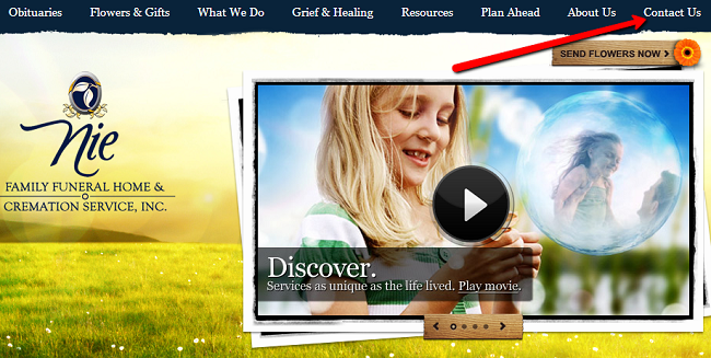
They use a “Contact Us” link, which is perfect, especially if your firm has multiple locations. You can use this “Contact Us” link to lead the user to the page where they can find all of your locations’ contact information.
#5 Your website isn’t mobile optimized
Now that 3 out of 4 U.S. adults own smartphones, there is no denying that people are accessing funeral home websites on mobile devices. In fact, one out of every four visitors on our f1Connect websites are currently accessing them through a mobile device!
In order to capture this mobile audience, you’ll need to make sure your website is more than just “mobile friendly”. A mobile-friendly website simply makes your website’s content easier to read on a mobile phone, but typically mobile-friendly websites are overloaded with too much information for someone on-the-go. What you need instead is a mobile optimized website.
The difference between a mobile-friendly and mobile optimized website is that a mobile optimized website is strategically structured to provide the content your website providers are looking for on-the-go. To learn more about the importance of a mobile optimized site, check out this blog that’s filled with tons of data that backs me up!
#6 You’re not turning website traffic into dollars
While having a website alone is a great business asset, wouldn’t it be nice to see some real, measurable ROI being generated from your website every month? Thanks to new funeral eCommerce solutions, you can. Many website providers offer an eCommerce sympathy store that allows you to effortlessly sell flowers and sympathy gifts, right from your website. The best part? You’ll earn up to 25% on every product sold.
In the example below, Wasik Funeral Home offers sympathy gifts and flowers on their website, and they generate between $2,000 – $3,000 in revenue every month. While it may feel weird trying to “sell” another thing to your families, think about it for a minute. By offering these products on your website, you’re helping those who can’t attend the service show how much they care, while also helping your families feel more support during their time of need.
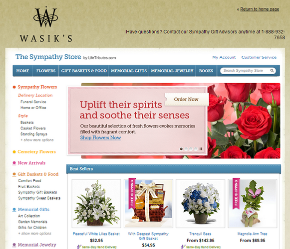
Wasik Funeral Home’s Sympathy Store integrates right into their website, allowing them to generate additional revenue from their website every month and offer a convenient service to their community.
#7 Your website isn’t ranking on search engines
Out of everything we’ve talked about so far, the one element that has the biggest impact on your bottom line is your funeral home’s rankings on search engines. If you want to attract new business, you have to make sure families can find you online first. That’s where search engine optimization (SEO) comes in.
SEO is the process of getting your website to rank well on search engines. By appearing at the top of search results, your funeral firm will stand out from the competition in all of that online clutter. To avoid losing business to your local competitors, try implementing some of these basic SEO tactics and you’ll see an increase in traffic and business in no time!
#8 You’re not producing fresh content
If there’s one sure-fire, free way to increase your website traffic and search engine optimization (SEO) efforts, it’s through content marketing (and particularly blogging). The case for blogging has become pretty substantial in the past few years – in fact many websites see their traffic double thanks to blogging.
I know it’s hard to find the time, but by not blogging, you’re letting your website collect what I like to call “Internet cobwebs”. In non-Internet geek terms, that means your website will be hiding underneath the funeral home websites who are blogging on search engines results, which has a HUGE affect on your bottom line. If you’re still not sold on blogging, check out this article on the other great benefits of blogging for funeral homes, and then get blogging…now!
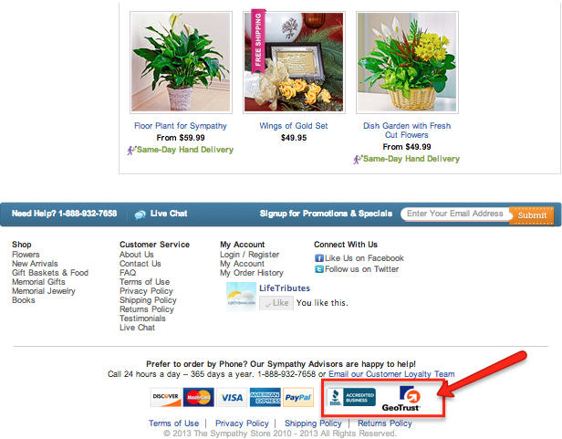
#9 Your website doesn’t display a sense of trust
We already know there’s a lack of trust in the funeral profession, so it’s important that your funeral home’s website puts those thoughts to rest. Consumers want to know your website is safe and secure, especially if you are offering products or services on it (we’ll get to that in the next point).
And if they don’t trust your website, according to this study by Kikscore, 90% of them will leave your funeral home’s website. By displaying trust certificates, security badges and safety seals on your website, you’ll make your website visitors feel comfortable sharing their personal information or contacting your firm.
#10 Your site loads slower than a snail
If there’s one thing that will make me click “X” on a website within seconds, it’s a slow loading website. This is 2013 now, which means there’s no excuse for a slow loading site. This is one of the biggest issues I see with many funeral home websites, and it’s very detrimental to your online presence.
In fact, this KISSmetrics study shows websites that take more than 2 seconds to load lose nearly half of their visitors. That’s huge! Think about it, if your website helps you bring in 50 new client families every year, that means you’d be turning away nearly 25 families a year! To avoid a slow loading website, be sure to keep it up-to-date, and make sure it’s page load time is optimized.
Now put your website to the test!
We know it’s really hard for anyone to judge their own website, so try this test:
Ask a few friends to look at your funeral home website’s homepage for 15 seconds. Then, ask them a few questions about what they remember seeing.
How did your web design make them feel? What were the main messages they took away from your website’s content? Did they remember the most important elements of your website?
Use the feedback from your friends to make changes accordingly. Before you know it, your website will be your number one tool for growing your business and attracting families!
Start growing your business with your website
Want a website that can help you grow your business and educate families? Get a free demo of funeralOne’s all-in-one, mobile optimized website platform, f1Connect by clicking here or giving us a call at 800-798-2575, ext. 5!


[…] If you were surprised by his response, here’s a reality check for you: everyday, more and more people are trading in their laptop or desktop computers for tablets and mobile phones. That means if your funeral home website isn’t optimized for mobile devices, it could be bad news for your business. […]
[…] website inspires visitors to want to celebrate life, and educates them on your value rather than scaring them away. Your website is the front door to your funeral home. Just as you may have a flowers or plants, […]
[…] But unfortunately, the funeral profession has had a hard time keeping up, and it’s causing many funeral homes to lose business because of their website. […]
[…] The other day I read that 75% of families who visit a funeral home website to learn more about them don’t actually end up contacting the firm. […]
[…] By keeping a pulse on the industry online, I can get a feel for where we need to seek improvement. And in this case, I wasn’t happy with what I found. Sure, more and more funeral homes are upgrading their website to a more professional layout, but I’m still seeing the same common mistakes in user experience, design and copywriting that tend to scare your website visitors away. […]