9 Elements You Should Remove From Your Funeral Home Website Today
September 5th, 2014
Every once in a while, I like to do a “spot check” on how the funeral profession is doing online.
This usually involves doing a Google search for “funeral homes [insert city/state]” and clicking on every result I see on the first page. I like to see how many funeral homes have a professional website presence, which ones have a website presence that’s less than extraordinary, and which funeral homes are using funeralOne’s website platform.
By keeping a pulse on the industry online, I can get a feel for where we need to seek improvement. And in this case, I wasn’t happy with what I found. Sure, more and more funeral homes are upgrading their website to a more professional layout, but I’m still seeing the same common mistakes in user experience, design and copywriting that tend to scare your website visitors away.
Here are the top 9 offenders I found on my search, and why you should remove them from your website… immediately:
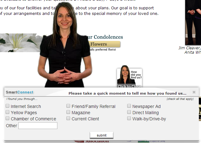
1. Anything that pops up in my face
For an example of what I’m talking about, I visited the website below and within seconds I jumped out of my chair at the sight of a woman asking me if there’s anything she can do for me. Thanks for trying to be helpful, but unless you’re trying to annoy me or get me to leave your website with annoying pop-up gimmicks, I’d prefer to search around your site myself. PS. Pop-ups are so Y2K, it’s time to give up on them.
2. Unresponsive website content
Since half of all website searches begin on mobile devices, you’d have to expect my search would, too. And when I clicked on many funeral home websites on my phone, I couldn’t read the text, couldn’t click on anything, and everything looked all jumbled up. A death can occur anywhere at any time, and chances are I’m not going to have time to jump on my laptop or desktop computer when I need a funeral home. Please, for the sake of your business and my sanity, make your funeral home’s website content responsive.
In the simplest of terms, a responsive website will shrink on a smaller screen (ie. mobile phones and tablets) and expand on a larger screen (ie. desktops). The users of today have come to expect this, so if your website isn’t responsive, you’re losing out on a lot of opportunities. If you’re looking for an award-winning mobile optimized website solution, be sure to check out f1Connect Mobile Websites here.
3. Cluttered content
I don’t know about you, but when I’m searching for something specific online, I don’t want to take the time to read a bunch of unnecessary content to find what I’m looking for. Try to imagine you are looking for a funeral home online. What are the first few pieces of information you’d want to know? Most likely your answer is service options, pricing, and contact info. If you had to read through paragraphs of content looking for that information, you’d probably click “X” so that you could find that information more quickly, wouldn’t you? Your website visitors would do the same thing. Take a look at your website to see if you have any content cluttering the key pages. If it doesn’t seem completely necessary, remove it. Trust me when I say that when it comes to website content, less is more.
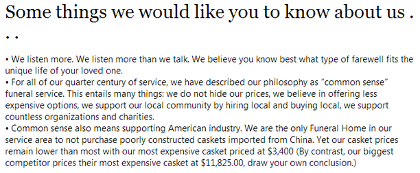
Here’s an example of a funeral home website that wrote nearly 800 words of content in this section on their homepage alone… talk about cluttered content!
4. Anything that slows down your website
Since 47% of consumers expect a web page to load in 2 seconds or less, it’s pretty clear that you’ll lose me if your website takes longer than that to load. If you think that’s bad, think about the consequences you’ll face if your funeral eCommerce store takes a long time to load. For every second that your website’s loading time is delayed, you lose out on 7% of conversions. That means if you’re making $10,000 from your eCommerce sympathy store, you’ll lose out on $700 per second delayed, annually. Be sure to remove anything that slows your website down, including animations, slideshows (more than one is overkill) and images and videos that aren’t optimized for web. It’s all about moderation and cutting out the clutter. Once you’ve done that, your funeral home website’s loading time should be just right.
5. Dark, depressing or outdated design elements
If there’s one thing I noticed about most funeral home websites’ design, it’s that they’re usually incredibly outdated, dark or gloomy. It’s 2014 people, engage your families with a website that doesn’t make them even more depressed when they click on it. Give your funeral home website a run through and make sure it’s an uplifting experience for the user. After all, we’re here to show families how we can help them celebrate their loved one’s life, aren’t we?
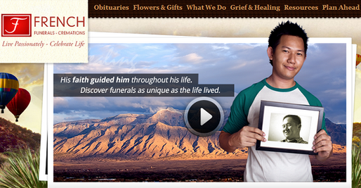
6. Cheesy stock photography
If there is one thing that irritates me more than anything, it’s tasteless stock photography. Sure, stock photography can be a good thing… if you choose it wisely. In fact, many website platforms in the funeral profession use stock photography in a very effective way (see below). However, many funeral homes choose stock photos tgat are just downright awful. For example, a man jumping in a wheat field while holding brief case is a bit much, and looks completely fake. If you can’t afford to hire a photographer for your website, do yourself a favor and use this guide to choose tasteful stock photography for your website.
An example of stock photography gone wrong:

An example of tasteful stock photography:
7. A “Contact Us” form in lieu of pricing.
The legal situation over our GPLs has caused much controversy in the funeral profession. But one thing we shouldn’t be arguing about is whether or not we should publish pricing on our website. If I’m a funeral consumer and I’m looking for a funeral home, pricing is one of the first thing’s I’ll expect to find on your website. No, I don’t want to call your funeral home to find out more about pricing. And no, I don’t want to fill out a contact form to find out about your pricing, either. I want an easy-to-understand GPL that will allow me to shop around online (since 98% of consumers do).
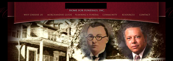
8. Pictures of your history and staff on your homepage
Here I am, on your homepage, and there’s no call-to-action, no offer, nothing that entices me to look any further. All I see is information on your staff and funeral home history, but nothing that’s helpful for me. If you really wanted to draw me in, you’d provide a call-to-action for me to learn about your services, to contact you, or to look at the service information for my loved one. But instead all I see is pictures of you. I don’t want to learn about you, I want to know how you can help me, so please provide a clear path for me to do that, or else I’ll be gone in seconds.
Does your website have any of these elements?
If so, it’s time to action and optimize your website for the families of today. If you’re not sure where to start, let us help! Give our Website Specialists a call at 800-798-2575, ext. 5. or click here to schedule a consultation with one of our Website Specialists.
What other elements drive you crazy about funeral home websites? Tell us in the comments below!


Greetings,
Here is a Totally free memorial app that allows all of us to remember together.
http://www.nmemorium.com
Great article Joe! There are so many different layouts that funeral homes have nowadays, I’ve always wondered which ones are getting the best results. You’ve got a lot of great information here. What I’ve also noticed, even though we’re supposed to be compassionate and celebrating life, is a lot of users are okay with shopping for funeral services like they shop for anything else on the web. A lot of times they want the best price and the best value. If you can portray that in the site without a lot of extra info , it seems to convert well.