A Look Back at 10+ Years of Funeral Website Design
August 22nd, 2013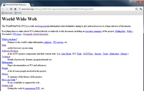
An image of the first web page ever created 20 years ago.
Website design has come a longggg way since I first started in this business in 2001.
But unfortunately, the funeral profession has had a hard time keeping up, and it’s causing many funeral homes to lose business because of their website.
Let’s take my experience the other day, for example. I was talking to a funeral home owner who said he hadn’t updated his website in a “few years.” So, I typed in his website address, and I almost fell out of my chair when I saw the date on his website. It read “Copyright 2001.”
The problem with having an outdated website (or, a website that looks like it was designed circa 1999) is that they don’t provide a credible web presence that inspires visitors to choose your funeral home. Instead, they inspire visitors to leave your website and choose a different funeral home.
To help you better understand the importance and value of good, up-to-date web design, join me for what I like to call the “blast from the past.”
I’m going to walk you through the evolution of my personal favorite funeral home website: O’Connor Mortuary. We’ll start off in 1999 with their first website design, and work our way to the present, dispelling the many web trends and designs that haven’t made it through to today (and why).
While we travel through time, see how your funeral home compares, and if you’re guilty of having any of these outdated elements on your own website.
Ready for our blast to the past? Okay, here we go:
1999
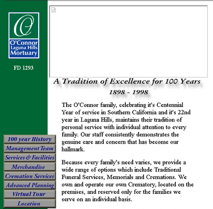
It may seem dated now, but back in 1999, this type of static website was very common – and actually pretty innovative. O’Connor Mortuary was ahead of the game, providing location and map information long before local search became important, and their virtual tour is very attractive. However, on the down side, in order to see the virtual tour, users needed to install a special plugin. Today that would probably be a simple image gallery that’s accessible to everyone and much more user-friendly.
Insights from the future:
One big thing we noticed about this website is the fact that it doesn’t contain any online obituaries. This shows a huge difference in the way communities used to be notified about a death, since most people read obituaries in the newspaper (along with many other things). Nowadays, newspapers hardly exist and most people turn to the Internet to research practically everything, making your website and its content more important than ever.
2004
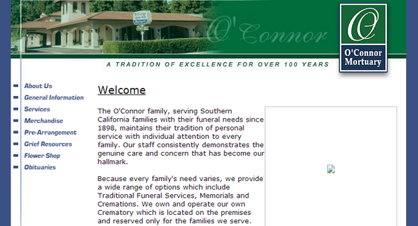
One big improvement in the 2004 design of O’Connor Mortuary’s website is the background that expands or contracts according to the screen size – a major step forward in making it visually appealing. It’s likely that this was based on the next evolution in web design which saw designers using CSS (cascading style sheets) to create better versions of table-like layouts.
Insights from the future:
For the first time, this site addresses some usability issues, breaking text into smaller paragraphs. However, the typography of this website is inconsistent, with the main text in sans serif and text on the obituaries page in serif font. Another big no-no that was all the rage in 2004 was an audio clip that loaded automatically. These days, most sites that have audio or video that automatically plays usually have a bad user experience, causing many visitors to quickly click “x” and move on to another website that’s not so disruptive.
2005
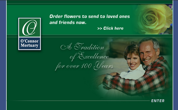
2005 saw the introduction of Flash (a platform that incorporates vector graphics, animation and other interactive multimedia) for O’Connor Mortuary. Here, we have a Flash-based splash page with rotating text snippets. One good addition to the 2005 site is that it includes a call to action for the first time, making it easier for them to generate business from their website. Plus, that darn auto-loading music is gone!
Insights from the future:
Flash was once seen as a good way to introduce dynamic content to a website, but it’s always had significant issues. It’s buggy, can be slow to load, isn’t user-friendly and is terrible for search engine optimization (SEO). The current trend is to avoid Flash-based web design. Unfortunately, many funeral home websites incorporate Flash, which isn’t good because it makes their site look outdated.
2007
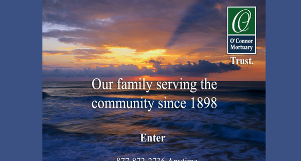
Ahh, 2007. This year, O’Connor incorporated larger images into their website, which definitely adds to the visual appeal. In fact, I want to go ahead and say that the current design of this website is better than 70% of funeral home websites out there today. Plus, their website is now more consistent and there’s a nice change of color when you hover over a menu item.
Insights from the future:
While the big, bold, beautiful images on the O’Connor website add to its visual appeal, you’ll notice that this version of the site asks the user to “enter.” This was very popular in the early to mid 2000’s, but I’m not sure why because it only adds another step for website visitors to take in order to find what they’re looking for. Plus, 2007 saw the auto-loading music come back, which can distract and annoy users. These three key issues could destroy the usability of a website if they existed today (unfortunately, in some funeral home websites, they still do).
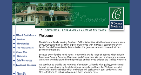
2009
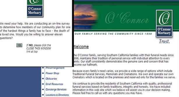
The 2009 version of the site made some important changes in terms of usability. For example, there are additional text-based navigation links in the footer for those who are unable to access the sidebar navigation menu. And there’s an email address where client families can contact the funeral home. Most importantly, there are links to social media profiles, reflecting the funeral home’s online presence and willingness to connect with families and their community.
However, there are still a couple of areas for improvement. The auto-playing music on the homepage is now continuous and there is also a pop-up survey window as soon as you enter the site, which isn’t very inviting and could drive some visitors away.
Insights from the future:
While the O’Connor Mortuary website has seen a lot of advancements during this decade, one thing has remained the same: their copy. If you take a close look at the copy of this homepage, you’ll see that it is full of information on O’Connor’s staff, history and traditions. The problem with this copy is that it provides zero benefits for families that choose their firm. Instead, it just tells their website visitors how great they are and how long they’ve been around. In today’s times, this information is far from helpful when consumers are doing the research required to make a purchasing decision. Thankfully, though, O’Connor considered this with the next version of their website…
2013
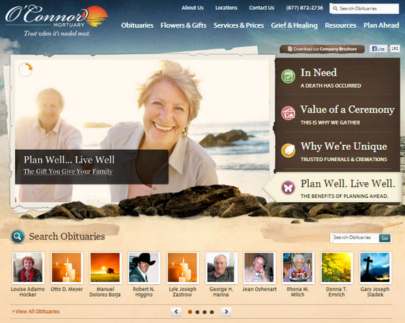
O’Connor Mortuary’s website, transformed by funeralOne.
It’s 2013 and web design has changed. The O’Connor website has come a long way in terms of usability and design – in fact it’s barely recognizable as the same entity as the 1999 version. Though our screenshot doesn’t show its full splendor, here are some of the major improvements we’ve seen in this design:
– It’s uplifting – this version of the site incorporates bright colors and images that are focused on helping families heal and inspiring them to celebrate the life lived.
– It passes the “Granny Test” – with intuitive, user-friendly information architecture and navigation, reflecting the funeral home’s awareness of the information client families need most.
– It includes call-to-actions – this site includes several bold, clickable call-to-actions that encourage visitors to take a desired action.
– It showcases service options in a unique way – instead of just listing services, this website presents them in an engaging way that truly educates families on the value and meaning of each service or product they provide.
– It incorporates funeral eCommerce to conveniently offer flowers and gifts, right on their website.
– It uses video and images rather than just content to engage visitors (now it’s click-to-pay not auto-play).
Insights from the future:
While today’s O’Connor Mortuary website knocks all aspects of web design out of the park, how will it stack up in the future? With more and more people using mobile phones, there is a huge piece of the puzzle missing for this website, which brings us to our next point…
The future?
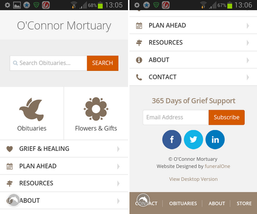
O’Connor Mortuary’s mobile website, created by funeralOne.
We’ve made no secret of the fact that mobile is the future for funeral home websites. That means just having a great desktop website won’t do. Nowadays, people are using mobile phones more than desktop computers, especially when they’re on-the-go. O’Connor Mortuary is keeping on trend with this beautifully designed mobile website.
The reason this mobile website works so well is that it makes it as fast and easy as possible for users to find what they need.
There is a prominent search box, large buttons, simplified content, social media integration, calls-to-action, and even a link to the desktop version of their site. Now that’s giving potential client families what they want, wherever they choose to access it – are you doing the same?
Is your website hurting your business?
If your funeral home website isn’t uplifting clean and mobile-optimized like today’s O’Connor Mortuary website, it could be hurting your business. To learn how to upgrade your website AND have a beautiful mobile optimized website, check out the f1Connect all-in-one website platform. Click here to schedule a free demo or give us a call at 800-798-2575, ext. 5.


[…] you want to know why outdated web design is bad for your funeral home, check out our recent post on website design history.) – And a third had no website at all. […]
[…] and looks like it’s taking you on a blast from the past. To make sure your design is up-to-date, check out this article for design tips.- Users are taken to a different website when they click on the funeral eCommerce […]