13 Elements Of The Perfect Funeral Home Website Homepage
February 2nd, 2020
The other day, I was doing some of my routine funeral industry research, and I was reminded of a statistic that absolutely blows my mind:
“Most people would prefer to pre-plan a funeral, but only 33% do because they can’t find the information they need”.
I don’t know about you, but to me, that’s a problem.
With 97% of consumers today turning to the web to find a reputable product or service, that can only mean one thing. In my opinion, that means the majority of funeral home websites aren’t giving potential families the information they’re looking for. Period.
So what do we do to make sure potential families have the information they need? That’s simple – a website that’s designed for families. But what does that even mean?
Let’s start simple and look at what makes a website HOMEPAGE great (and mostly, why)…
Why your homepage design really matters
Your funeral home website’s homepage is the launching pad of your business online. It’s like your welcome mat, engaging visitors and inviting them to go deeper into your website and find out more about you. Usually, we think of web design as a creative process (the colors, the font, etc.), but there’s a ton of science behind how people react to your funeral home website’s homepage.
By understanding the science and the psychological triggers, you can create a website that gives client families what they want. And let’s be honest, having a successful website homepage will make your funeral home more successful.
Check out these 13 areas of great funeral homepage design below and see how your funeral home website is doing:
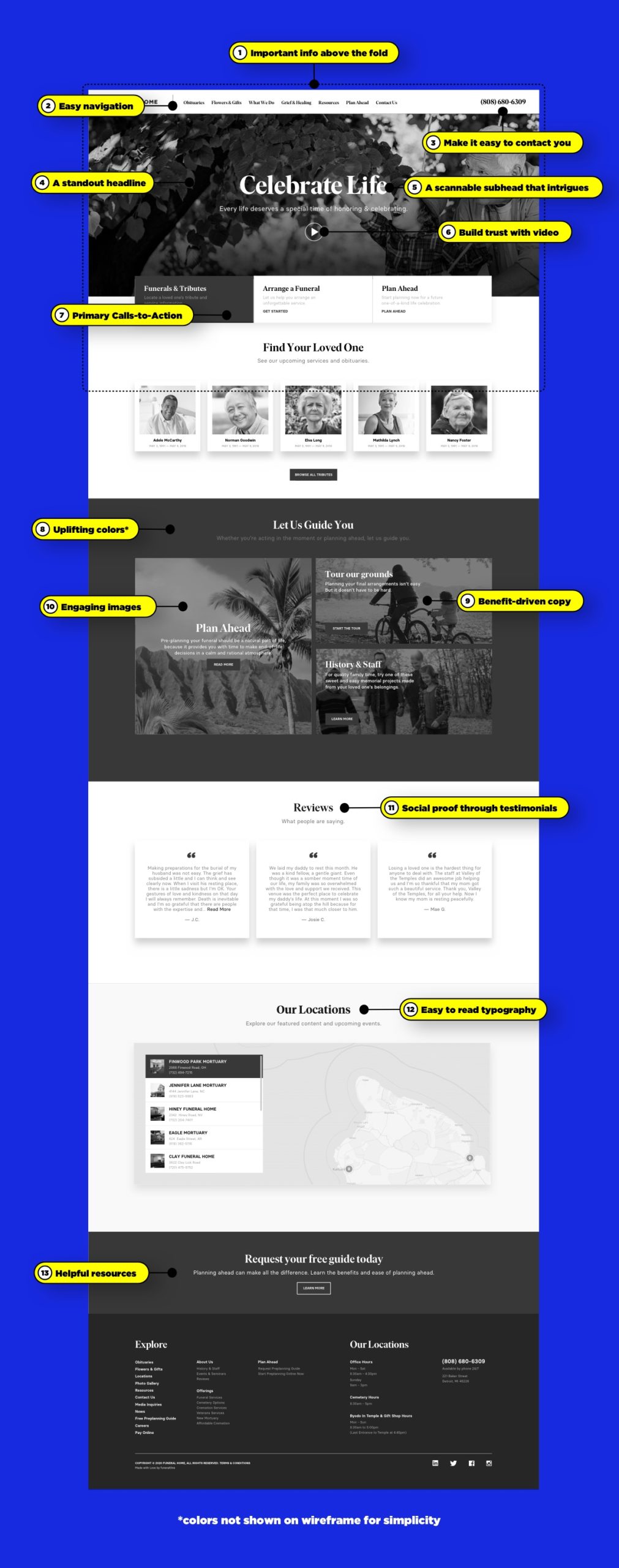
1. Important info above the fold
I don’t know why we use print-based metaphors for the web, but we do. That’s why you hear people talking about “above the fold” – the top part of a homepage that’s visible without scrolling.
Some people believe it’s important to put the most important information above the fold to ensure that people see it, while others think the fold is a myth. Due to our studies, we recommend keeping the most important information in a prominent spot, above the fold, on your homepage.
2. Easy navigation
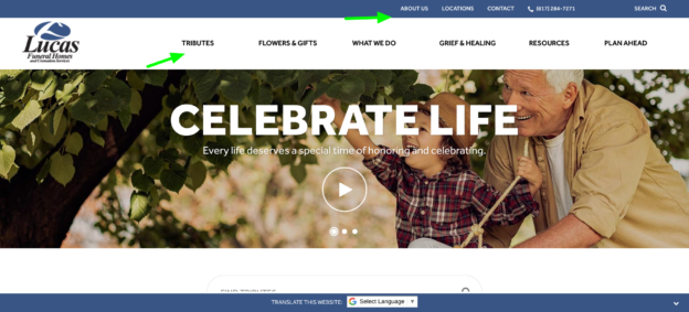
A visit to your funeral home website shouldn’t feel like a fun maze. There should be clear, concise paths to the things your families are most looking for. Some of the top things families are looking for on your website are obituaries and service times, ways to show their support, how to arrange a funeral service and directions to your funeral home.
There are many others, and it’s important to do your own research, or choose a website platform that has done this research for you and knows how to best navigate your potential client families to what they’re looking for. Below, you can see that Lucas Funeral Homes has done their research and made their top client family requests part of their navigation.
3. A standout headline
First impressions count. That’s especially true on your website. According to Anagard, website visitors have a six second attention span (according to this study, it’s even shorter). That’s not very long for your website to make a good first impression, and makes the case for a standout headline on your site.
Try it yourself – visit your website and take note of what you observe in the first few seconds. Do your headlines communicate what you’re all about and what makes you stand out? Make sure your headlines engage potential families and gives them the information they need to stay on your site.
4. A scannable subhead that intrigues
Subtitles are crucial for getting potential families interested enough to go further into your website. The science shows that size matters – and probably not the way you think. It seems sensible to keep sub-headlines short to match attention spans, but that’s wrong. An Outbrain study shows that headlines of 16 to 18 words achieve more clicks than any others. And if people are clicking, they are staying on your site.
A lot of times, subheadings are used by marketers to really hone in on the pain points potential customers are experiencing. In your case, these pain points can be very personal depending on the structure of your business and the types of families you serve. Keep it personal!
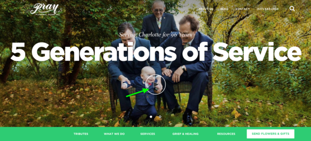
5. Build trust with video
Still on the subject of visuals, let’s talk about video. If you’re not using it on your site, you should be. This article on Forbes points out that we’re conditioned to pay attention to faces, voices, movement and body language. So, videos work well for attracting attention and keeping people on your site.
Video marketing has taken over the last couple of years, and videos are among the most watched online content, especially on mobile devices. When people see you on video, they trust you more. Add to that the positive impact of video on conversion rates and SEO, and it’s a no-brainer to use video on your website. Use video to showcase your services, make your funeral home human and answer questions that client families have.
As you can see below, Pray Funeral Home uses a video to drive home the point of their loyalty to their client families for over 96 years:
6. Primary Calls-to-Action
One important thing to include on your website is a call-to-action to tell families what you want them to do next. A good call-to-action makes people believe something better is around the corner and it’s a design element you can’t ignore. In fact, other web design features like type and color also play into the effectiveness of your CTA. Get it right and you will connect with more client families; get it wrong and they will ignore you.
7. Uplifting colors
Let’s talk about color. Personally, I’m tired of seeing monochrome, depressing funeral home websites. If you want client families to see their end of life as a celebration, then your website must reflect that. Choosing the right colors will help. Studies show that color elicits emotion,sends positive messages and attracts attention. That’s why you’ll see the colors on most of our funeral home websites suggest enthusiasm, energy and life. As a side note, our wireframe is in black and white to highlight simple features, but the live version of all of our websites have bright and uplifting colors.
8. Benefit-driven copy
It’s not just about what you do at your funeral home, but why you do it. And even more, it’s important to speak the “why” (or the value) in your readers language, rather than yours. In other words, find out exactly why your client families choose your services, and use their testimonials and reviews as inspiration for your website copy.
Client families will look at your headline and first sentence on your funeral home website, then scan subheads and paragraphs. That means that if you want your website content to be effective, your main content needs to be focused on the perceived value and benefits for your client families. Check out March Funeral Home’s website for a great example of this.
9. Engaging images
Ever been to a website, looked at a picture and thought “what were they thinking?” Me too. Choosing the right picture makes a heck of a difference to potential families’ perception of your funeral home website. You can also use images to direct readers’ attention to the parts of your site you want to highlight. Our eyes naturally follow other people’s eyes, and they follow arrows too. This is known as “visual direction” and there are some good examples in this Tutsplus article.
In addition, we also respond to the emotion shown on faces in pictures on websites. So you can influence families’ emotions with the right photo choice. Then there’s the question of size and the trend towards using bigger images – according to Econsultancy, bigger images can improve conversions.
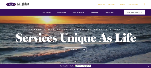
You can take your photos even further and bring them alive through video clips, like this peaceful one of the ocean on J.T. Fisher Funeral Service’s website.
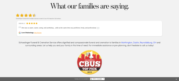
10. Social proof through testimonials
It’s one thing to tell your potential client families why your services are valuable, but it’s another thing to have your past clients tell them for you. Include quotes, names, and even photos of testimonials from your past client families. Don’t have any yet? Check out this guide for growing your business with online reviews and testimonials.
11. Easy to read typography
Did you know that your chosen typography affects conversions on your website? If you want more people to read your website content, use fonts that are big and easy to read. Also, don’t forget to pay attention to the number of words on the line, the spacing between letters and line spacing. Client families may not realize this affects their attention span and level of interest, but it does. In your web design, typography also helps you highlight the most important elements on the page and create visual hierarchy (that’s why we use different sizes for headings and subheadings).
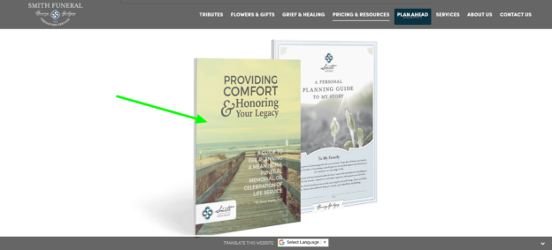
12. Helpful resources
Most of your website visitors will not be ready to pull the trigger (pun intended). In other words, they won’t have an immediate need for your services. Most of your website visitors are likely family and friends of your client families looking up service times and obituaries.
One way to engage these visitors is by offering them free resources on planning a funeral, personalization tips, grief resources… the list goes on! By offering these resources, you’re educating your client families and by doing so, you’re building rapport and trust with them, which is a huge factor when it comes to making huge life decisions such as funeral services. Try something like this free planning guide Smith Funeral & Cremation offers on their site.
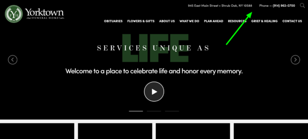
13. Make it easy to contact you
The most important thing a family will need to choose you is how they can contact you. Our research shows putting contact info on the top right hand side of your site like the example below is the way to go. Whatever you do, don’t forget this key information! You’d be surprised how often we don’t see it on funeral home websites.
Want to see how your website design is doing?
If you’re not sure where to start, let us help! Give our Funeral Success Specialists a call at 800-798-2575, ext. 5. or click here to schedule a consultation with one of our specialists.
What do you think about these elements of a successful funeral website homepage? Tell us in the comments below!


[…] It’s worth remembering that online video has had a huge boom in the last year or so, especially among mobile device users. It’s an easy way to connect with families and show your relevance to them. Check out some of the subtle cues you can use to make your website more appealing in our article on thepsychology of funeral home website design. […]
[…] I don’t know about you, but when I’m searching for something specific online, I don’t want to take the time to read a bunch of unnecessary content to find what I’m looking for. Try to imagine you are looking for a funeral home online. What are the first few pieces of information you’d want to know? Most likely your answer is service options, pricing, and contact info. If you had to read through paragraphs of content looking for that information, you’d probably click “X” so that you could find that information more quickly, wouldn’t you? Your website visitors would do the same thing. Take a look at your website to see if you have any content cluttering the key pages. If it doesn’t seem completely necessary, remove it. Trust me when I say that when it comes to website content, less is more. […]
Wow! Great article i like your writing style.
Interesting to see how these showcased sites for funeral homes are mostly lightweight viewing, right off the bat. I own an SEO and Marketing company so seeing these is a breath of fresh, so to speak. I mean no offense. My focus is getting my clients ranked in Google and your post here has shown me things can be different than they were before, in web terms. Not everything associated with death has to be dark or gloomy. THAT is what gets noticed. Positive differences. Thank you, Travis for showing a business owner a how-to.
A super post, full of specific advice and practical suggestions supported by examples- very generous of you to share- thank you
Thanks Bob! Glad you got something out of it. Blessings!