4 Companies With Epic Website Designs (And What The Funeral Profession Can Learn From Them)
April 9th, 2019
Through all our days of doing funeral home website design at f1, we’ve come across a few good gems that inspire us in a BIG way.
In fact, if you come by and visit the headquarters, you’ll usually catch our CEO scrolling through some of the hottest website designs day in and out, because design isn’t just his hobby, it’s his obsession.
So yeah… website design is a pretty big deal to us.
We wanted to inspire you in the realm of design when it comes to your funeral home website, too. So, we took some pretty epic websites from around the web, and want to share them with you today.
But first… why is website design important when it comes to your funeral home?
Well… here’s a couple of statistics, in case you need a little kick in the butt:
“Judgements on a company’s credibility are 75% based on the company’s website design.” (source)
“A study found that, first impressions are 94% design-related.”(source)
“38% of people stop engaging with a website if the content or layout is poor quality”
Convinced that your funeral home website design is important, yet?
Great, now it’s time to get inspired.
Here are FOUR inspiring websites, what we love about them, and what we, in the funeral profession, can learn from them:
1. Zero Financial
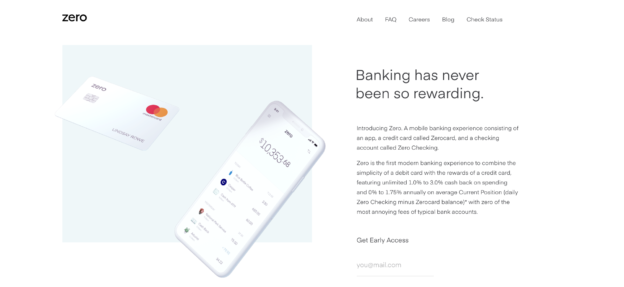
I must admit, anything to do with banking leaves a daunting feeling in my stomach. Luckily, Zero Financial’s website eases all of daunted-ness in my system, and feels like a breath of fresh air for a website in the banking industry.
What’s awesome about the website:
- The first thing you’ll notice about the website is that its design is far from the average design you’ll see on a banking website. It’s light, airy, approachable.
- It’s really nice to see their products up close and personal. Even something as “boring” as a credit card can be bright and exciting to look at!
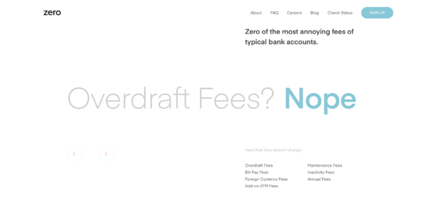
- The messaging highlights what makes Zero different from the average bank very quickly, clearly, and beautifully. In the photo below, it highlights one of the “annoying fees of typical bank accounts”, but if you visit the actual website, you’ll see a video that flashes all the dreaded fees a bank account sneaks on to you. This caused me to breathe a sigh of relief, and actually sign up for the account myself.
What your funeral home can learn from it:
The message here is to not be shy with your value. Get up close and personal with your client families on your website. Show them your products and services very closely. Tell them right away why your funeral home is different than the others. Put it in BIG writing. Let it be known quickly and easily. Otherwise, why should potential families stay on your site?
Recommended reading: How to Build Trust with Families with Online Reviews In 6 Easy Steps
2. National Geographic Magazine
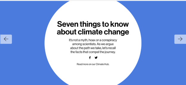
It’s not very easy to make a long story short. And it’s definitely no stroll in the park to make a lot of data visually pleasing and engaging. But, this special edition educational website from National Geographic did just that.
What’s awesome about the website:
- This website’s storytelling thread is strong and beautifully done. They really take you through the story of climate change in a way that your mind naturally would, touching on all elements such as your objections and suspicions.
- The animations really emphasize the impact of this story they’re telling. They are discreet enough to not be distracting, but clear enough to not need many words to accompany them.
- Lastly, this piece inspires you to take action without forcing you to. It gives you the information at hand, and the ways you can get involved, and leaves it up to you. We really love this approach to activism.
What your funeral home can learn from it:
If there is one skill needed more than ever from funeral directors, it’s the ability to tell a good story. Families aren’t really concerned with looking at the different services you have if they aren’t weaved into an engaging story.
Consider this your invitation to think outside the product catalog, and start thinking about the story of your funeral home’s experience. That’s what will create a remarkable funeral home website.
Recommended reading: The Funeral Director Job Description of the Future
3. Kin HR
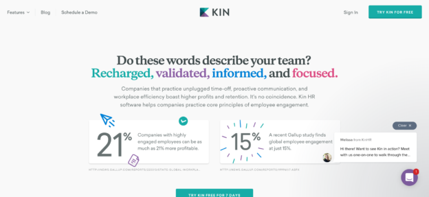
When’s the last time you were greeted with scientifically-backed research AND testimonials that highlight why you should choose a certain product? I was convinced from the moment I clicked on Kin’s website to dig deeper into their product. And I’m not looking for employment management software, so that really says a lot about how they draw their website visitors in.
What’s awesome about the website:
- Instead of driving home the features of a product, Kin asks you to engage with their website by asking you a question. They use words that really drive home the emotional value of what they do: Recharged, validated, informed, and focused. And then, they take it further by hyperlinking the elements of their products that embody those words. It’s genius, really.
- Kin invites you to “play” with their product immediately, with their call-to-action (CTA) being to demo it for 7 days for free. This makes it easy to say yes for the website visitor.
- Another noteworthy element is the pop-up chat in the bottom right-hand corner, where an employee asks if you’d like to get a one-on-one tour of Kin. It’s done very well, and tasteful… heck, I’d try it!
What your funeral home can learn from it:
Kin can teach funeral home’s a lot when it comes to website design, the most important lesson being HOW you invite your families to choose your funeral home. What is your call-to-action? Is it enticing, engaging and friendly? Make your call-to-action to come in and start the conversation. Try different wording that you know would resonate with your families. The key is to experiment and see what really works.
Recommended reading: 5 Things It’s Time to Finally “Kill” On Your Funeral Home Website
4. Apple
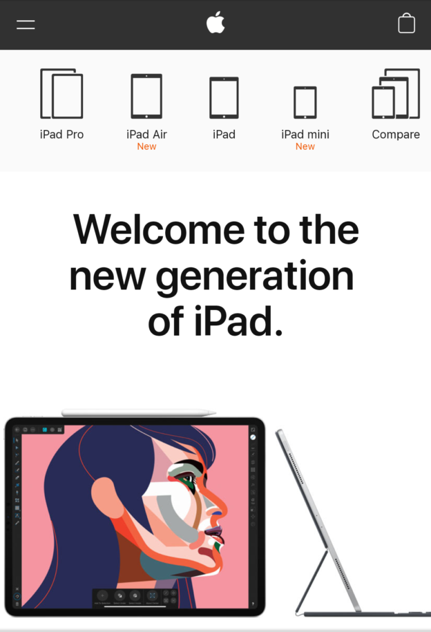
We wouldn’t do a funeral home website design article without mentioning our greatest inspiration for web design: Apple. This time, we’re celebrating their mobile website. Did you know that up to 70% of all website traffic happens on a mobile device? So if your mobile website isn’t so mobile, check out Apple’s for some inspiration.
What’s awesome about the website:
- When someone lands on a mobile website, they want to get what they need, fast. Apple does a beautiful job at doing that. Their sliding header in the photo above allows the user to quickly browse the sizes, features and pricing of Apple’s products in seconds.
- The photography on the mobile and desktop site really jumps out at you, capturing you, and even invoking an “ohhh” or an “ahhh” as you stare at the screen in awe. This is a special gift not many websites can do well, and Apple does it best.
- The simplicity of Apple’s website design is what it makes it so powerful. The headings and short subheadlines do all the work. No need for pages and pages of content.
What your funeral home can learn from it:
Everything we can learn from Apple comes down to one of my favorite acronymns of all time: “K-I-S-S”, which stands for “keep it simple, stupid!” Let engaging content and photos lead the way. Trust us, less is always more.
Recommended reading: Embracing The Tech Habits of Americans Age 50 and Older
Looking for your own funeral home website redesign?
Your funeral home website is meant to be the foundation of your online presence, inspiring families to connect deeper with you and understand the value of your products and services. If your website isn’t doing just that for you, it might be time to consider a re-design. We’d love to hear how we can help you create the website your funeral home truly needs. Click here to reach out to one of our Funeral Success Specialists, or give us a call at (800) 798-2575.
What websites inspire you the most? Share the link with us in the comments below!


[…] post 4 Companies With Epic Website Designs (And What The Funeral Profession Can Learn From Them) appeared first on funeralOne […]
[…] post 4 Companies With Epic Website Designs (And What The Funeral Profession Can Learn From Them) appeared first on funeralOne […]
Hi
I know what you are saying is so right. My biggest problem is time.
As a small funeral home with just 4 staff, to post our face book stories etc and to update our website is a constant problem.
However I know we must somehow attend to this part of our business otherwise we are winking in the dark.
Would love your comments
regards
Greg Collier
Hi Greg,
Thanks for the honest response, and it’s people like you who we love chatting about new ideas with! I would say, hiring an intern who is in mortuary school or interested in being in this line of work is one FREE way to solve the digital marketing issue. Although it will take a few hours of training up front, it will be well worth the investment if you keep them on for at least 3 months!
Another suggestion is getting a website platform that doesn’t really require maintenance, and can be easily updated by an intern. Have you taken a look at our website platform yet? Just a suggestion, let me know if you’d like to learn more!
– Krystal